
Simplified Geometry & Basic Shapes
In 2024, you will hardly surprise anyone if you create logos based on a complex logomark. Such logos are usually hard to remember, and the target audience may find it challenging to build a bond between the company name and its graphic representation. This can be a huge problem for big businesses seeking to reinforce their presence and increase brand awareness. Therefore, there is a tendency for companies to opt for something fundamental and we clearly see it in corporate logo design trends.
Basic geometric shapes are various triangles, circles, squares, dots, and clean lines, which bring logo designs to a simplistic image. In compensation, designers suggest using a vibrant, high-contrast color scheme (sometimes associated with a brand story even better than the logo). Or, on the contrary, switch to black & white and bring this minimalist effect of simple round and square logos to a maximum. Finally, negative space is another great way to adopt simple geometry and sustain visual interest.
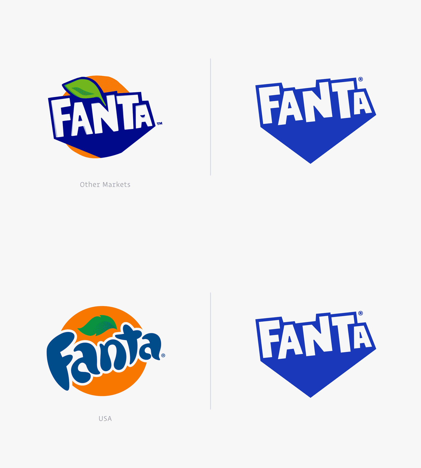
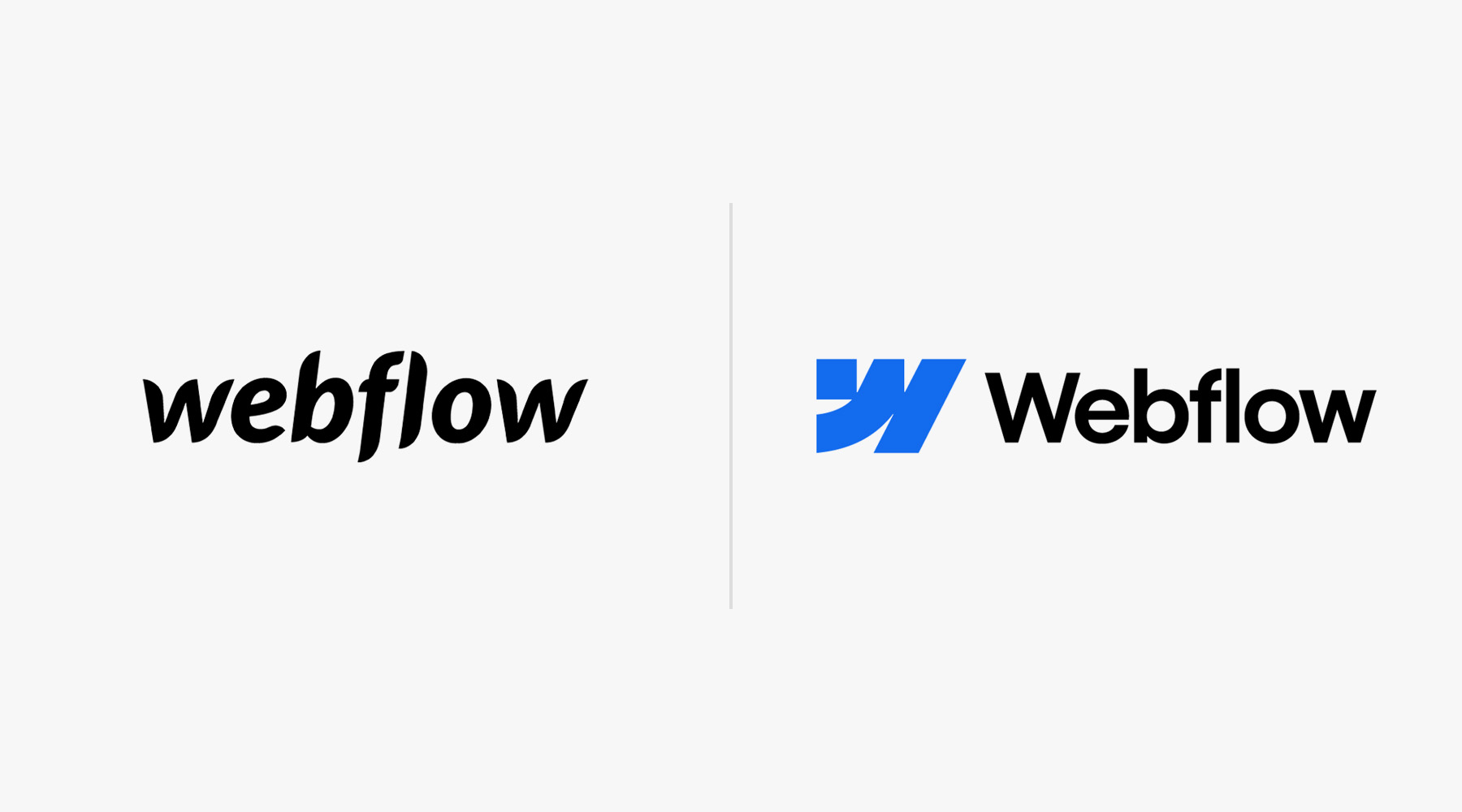
The principle “Less is more” isn’t new in graphic design, nor is this a stand-alone logo design trend. For example, in 2021, KIA or Google redesigned their logos (which initially were quite simple and reserved) using simple shapes. In 2022, Citroën introduced a similar redesign. In 2024 followed even more companies, including Fanta (they refused the iconic orange in favor of the white-blue color combination) and Webflow (WF Visual Sans + a simple geometric logo mark).
It’s vital to note that the logo trends of basic geometric shapes doesn’t strictly refer to logo marks. It is about fonts, too — but this happens less frequently and is more associated with the global typography trends and the overall popularity of minimalist types.